The original logo was quickly sketched by the team during the early stages of the company’s formation. While it carried sentimental value, it lacked refinement and did not reflect the professionalism or historical depth of the Sharukhan brand. The design appeared inconsistent with the company’s aesthetic and failed to inspire trust. Compared to competitors with more polished visual identities, Sharukhan’s branding felt underdeveloped and less credible.
My role:
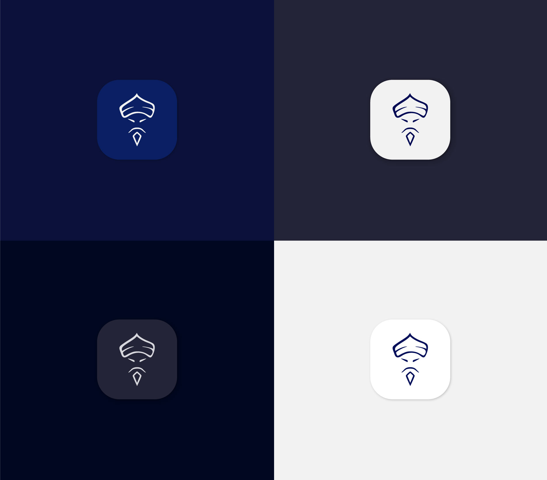
My role was to modernize the logo, refine and expand the brand’s visual style, and create a detailed, visually appealing design that builds trust and highlights the brand’s strength and professionalism.
About the company:
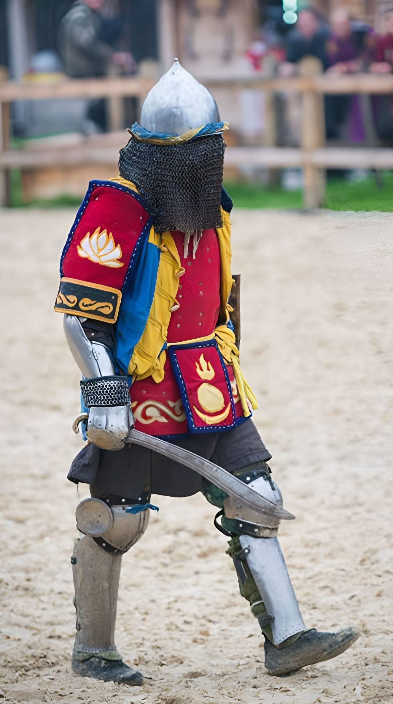
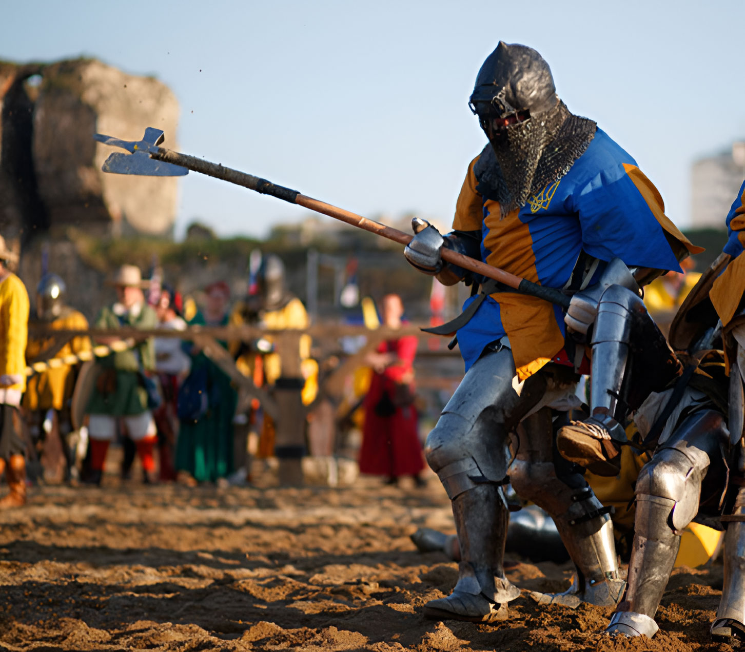
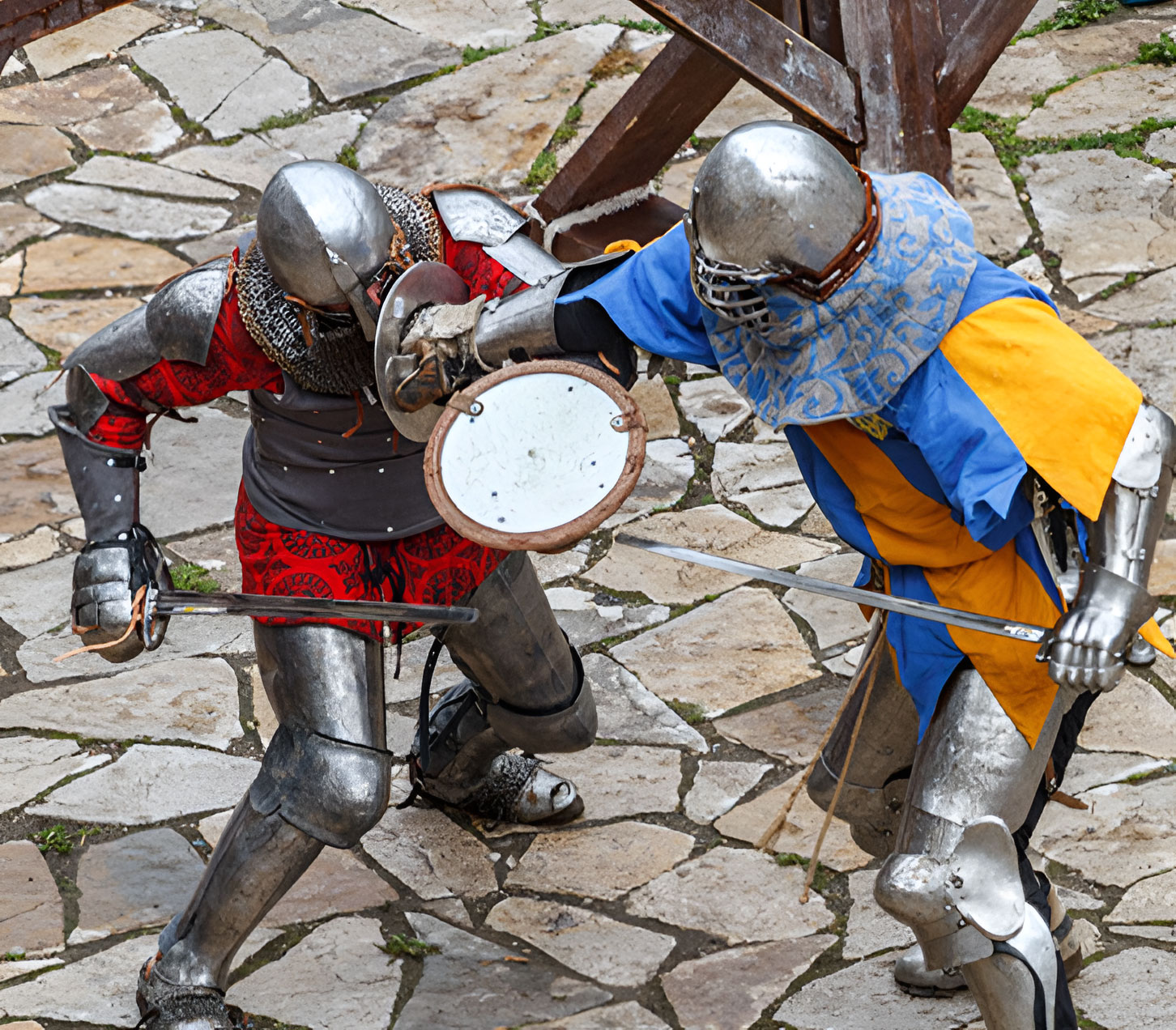
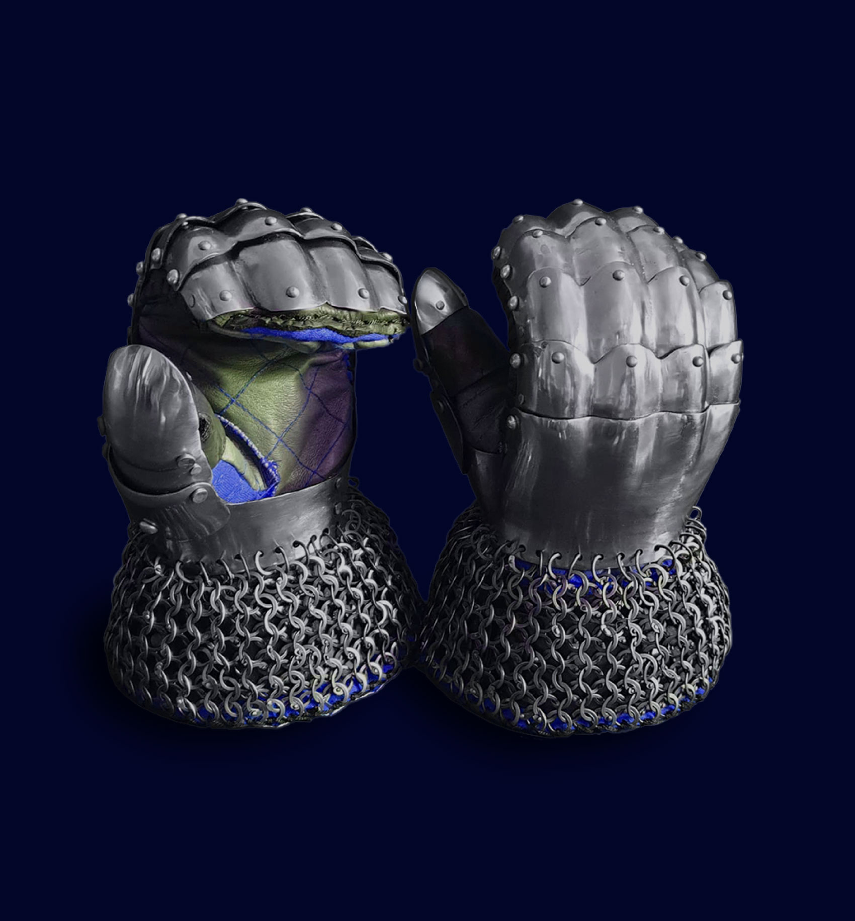
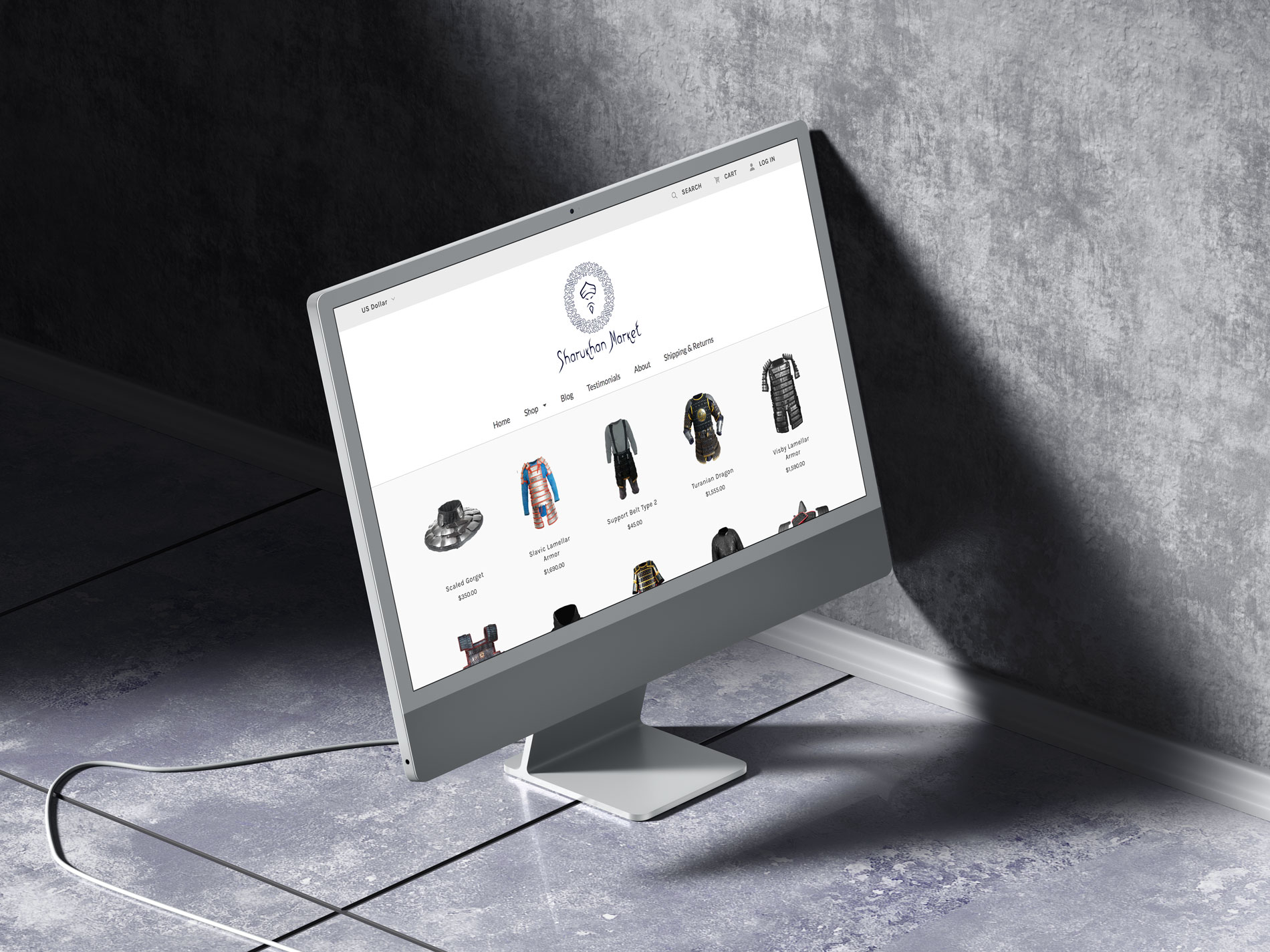
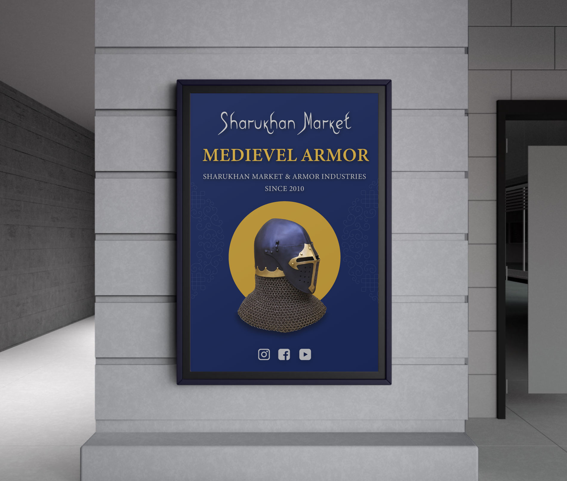
Sharukhan Market is a Ukrainian workshop and online store specializing in high-quality, handcrafted medieval armor and weapons.Their products are designed for historical reenactment, buhurt sport, HMB competitions, SCA heavy fighting, and LARP.With over a decade of experience, their network of skilled blacksmiths and armorers produces reliable, authentic equipment recognized across Europe.Each piece is custom-made to ensure a perfect fit, embodying the philosophy that armor should serve as a “second skin.”
Solution:
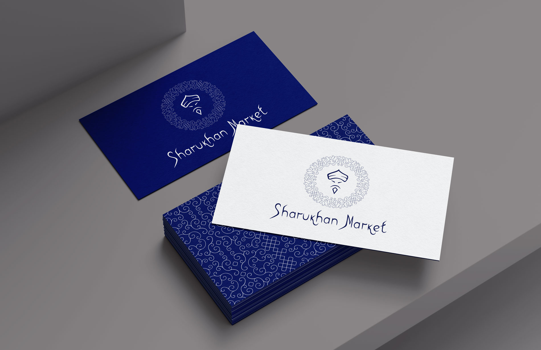
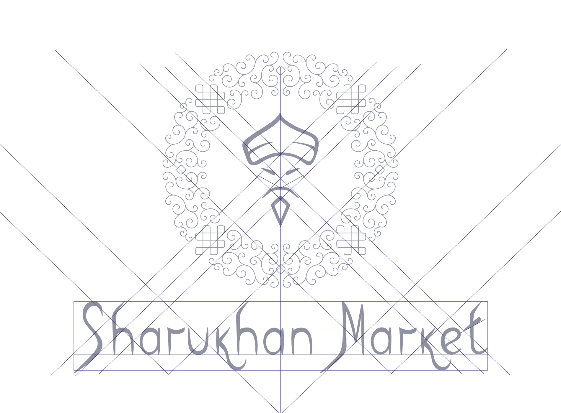
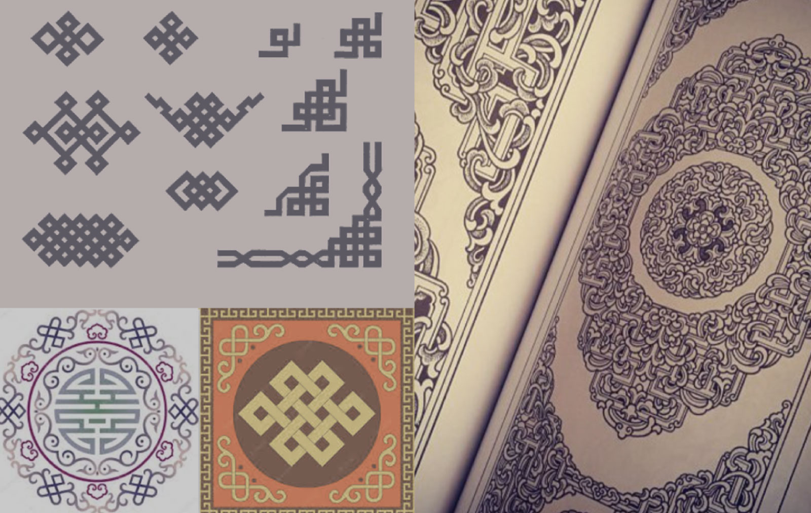
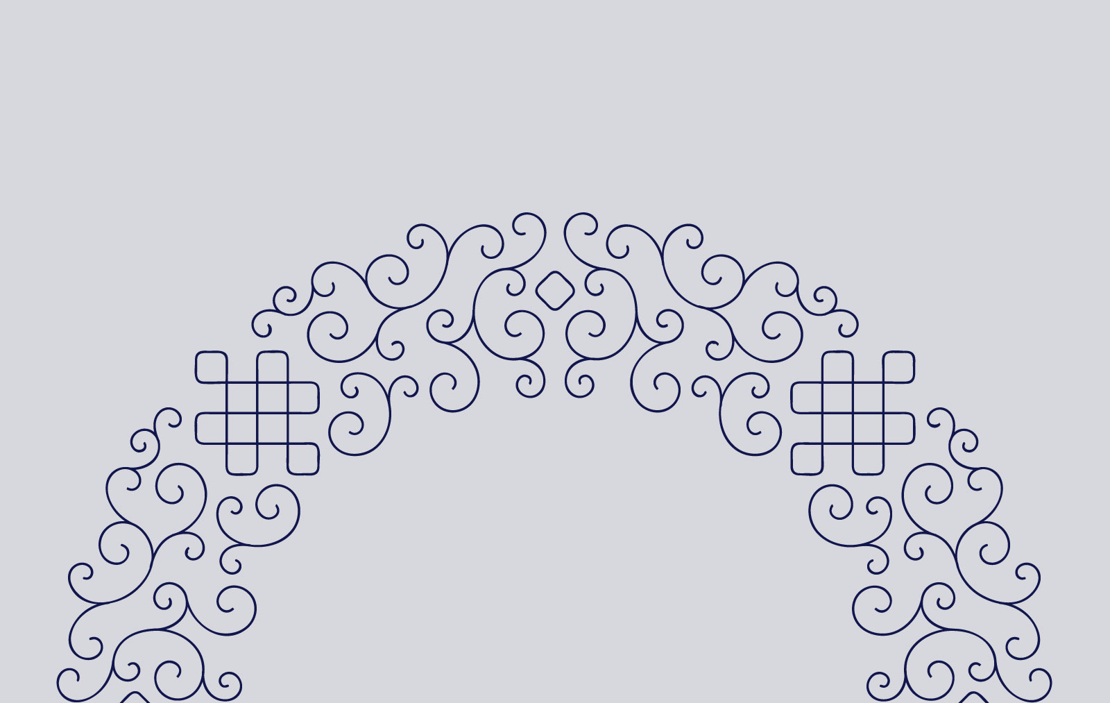
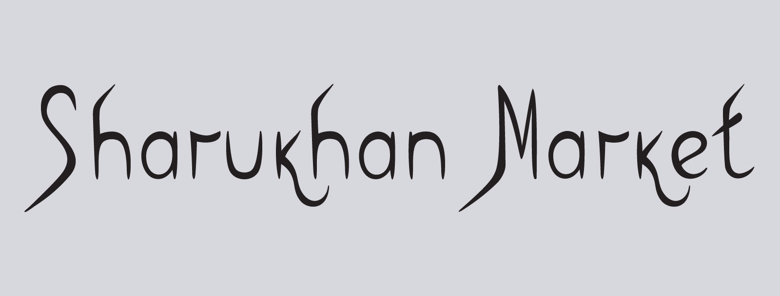
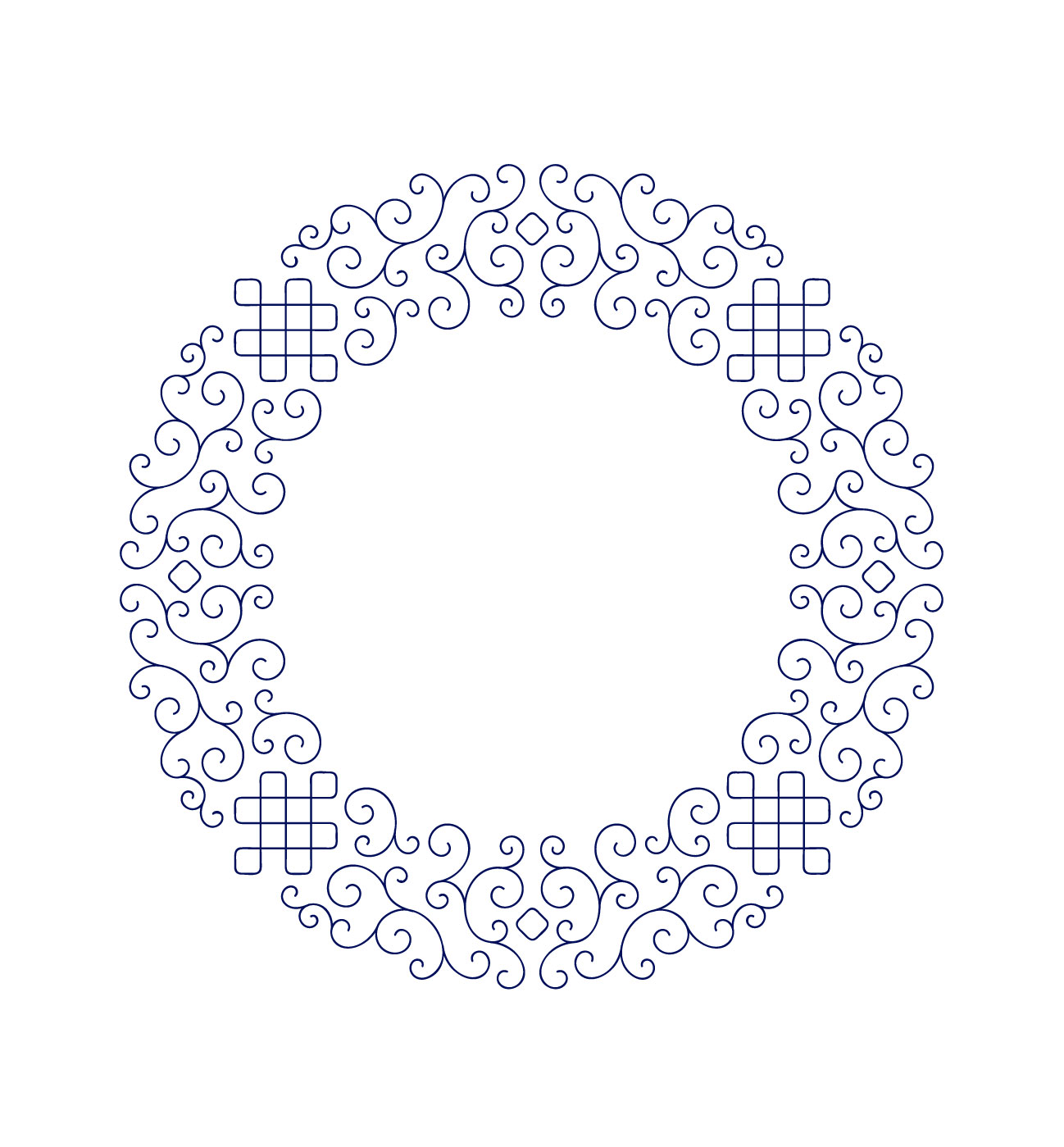
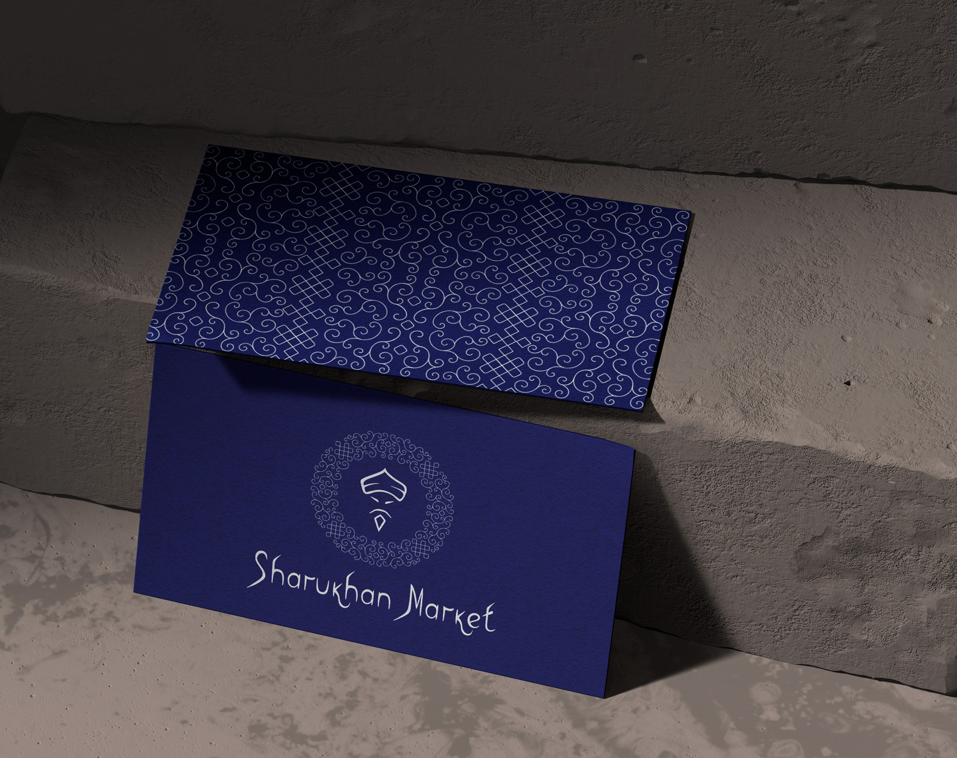
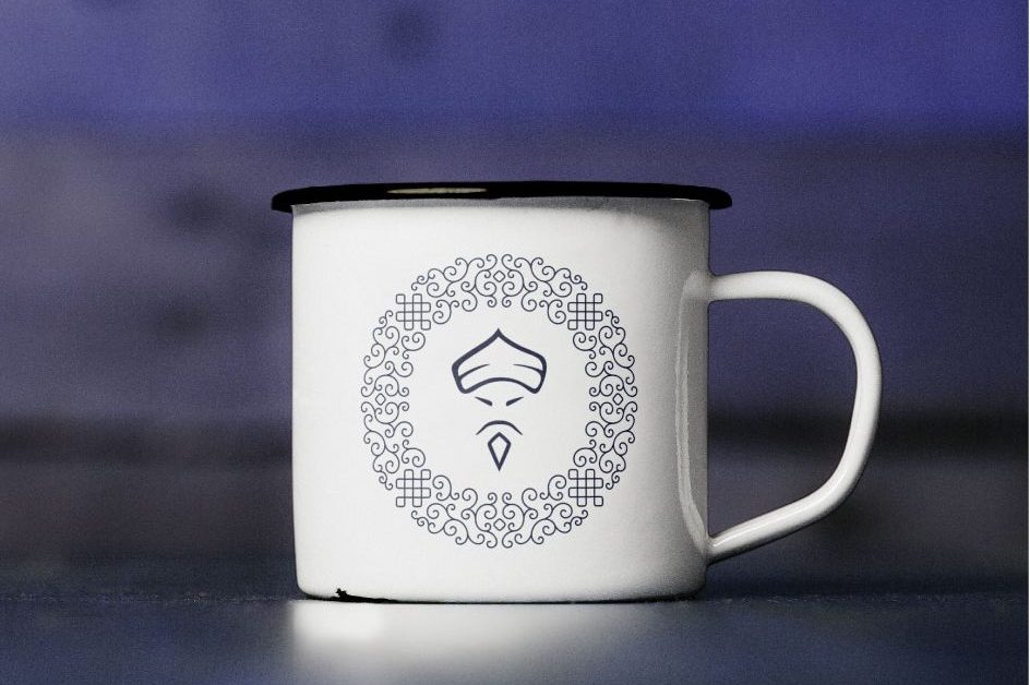
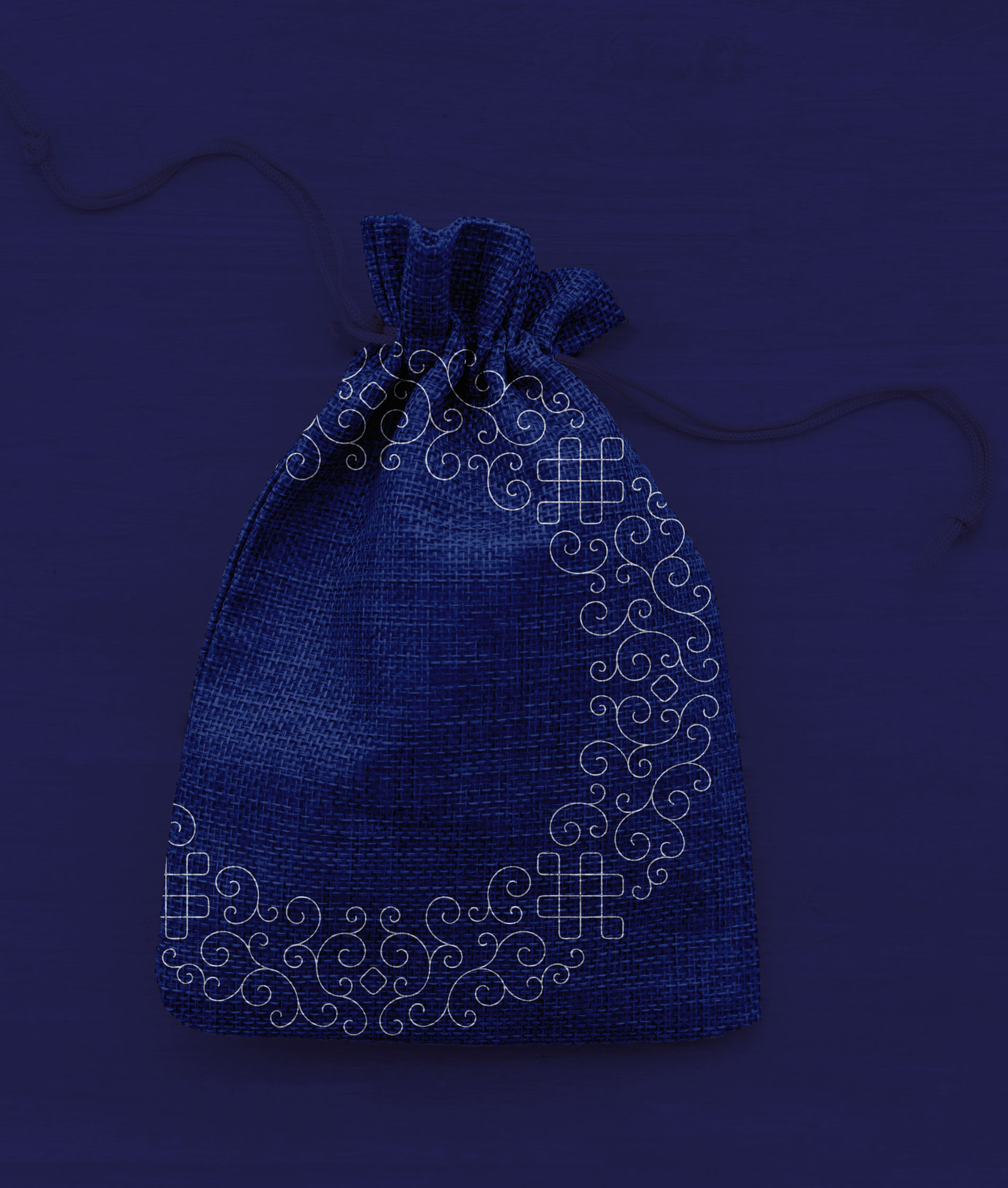
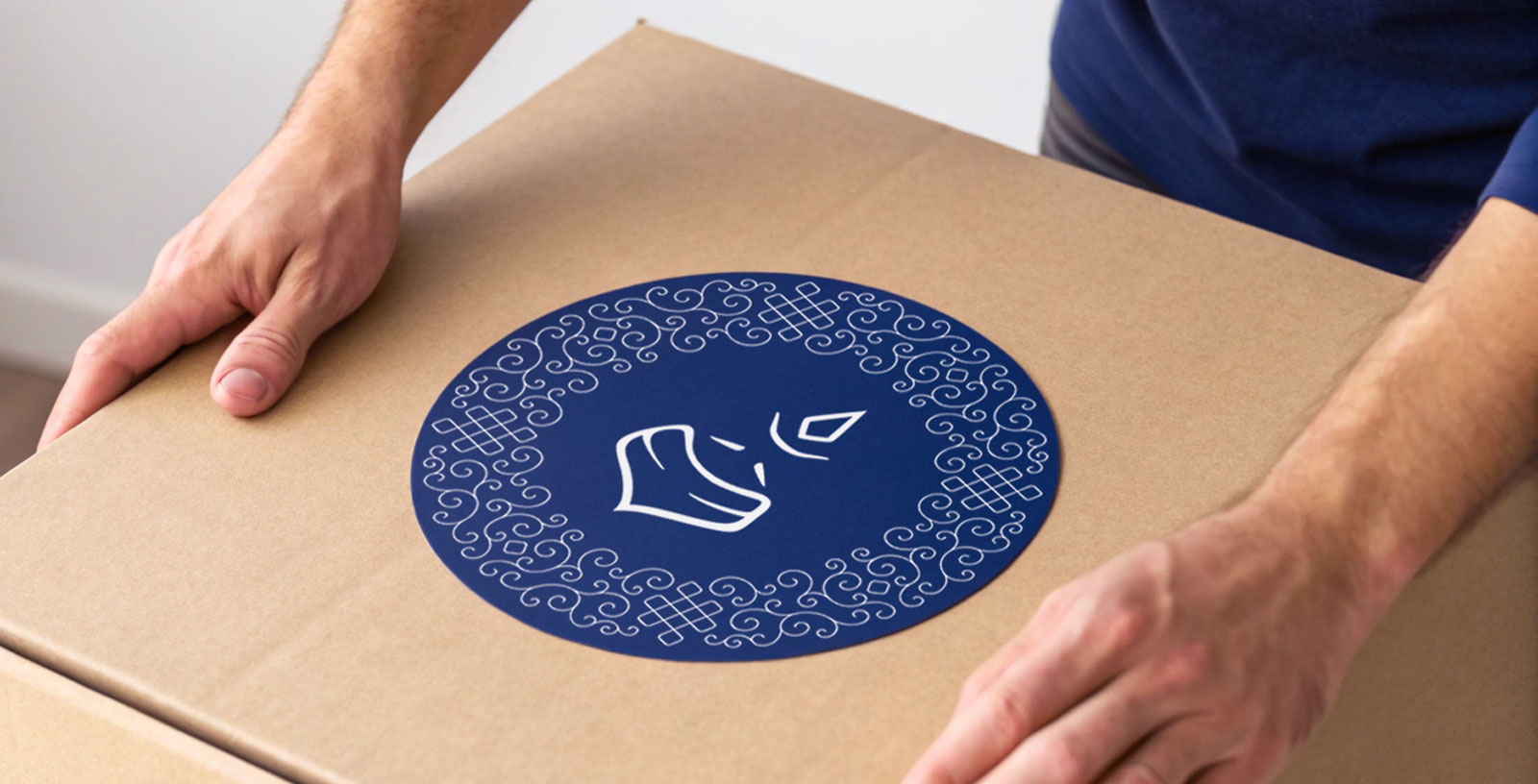
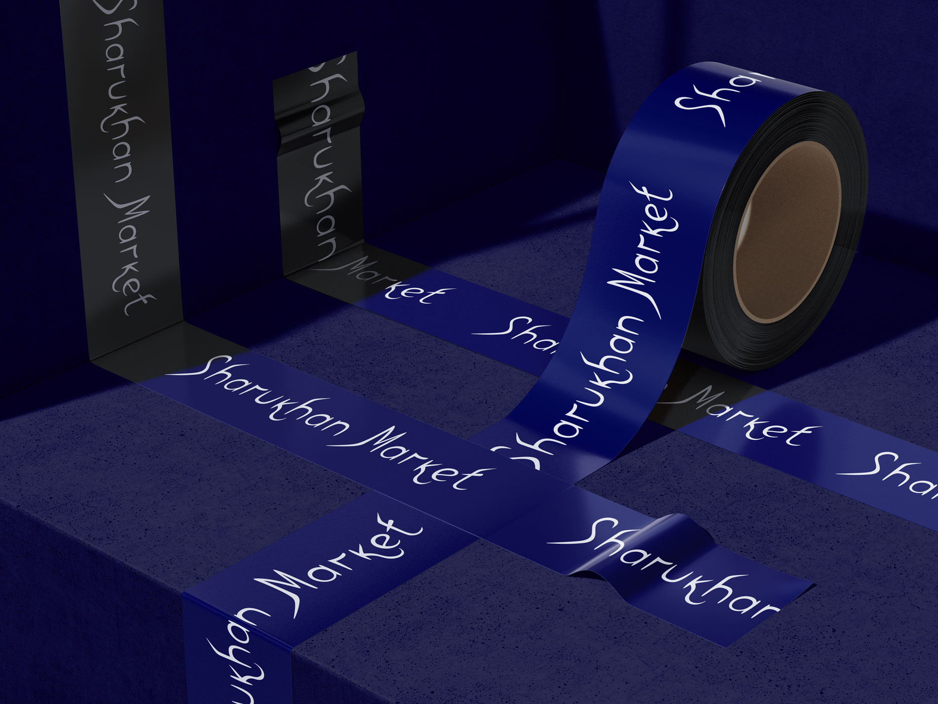
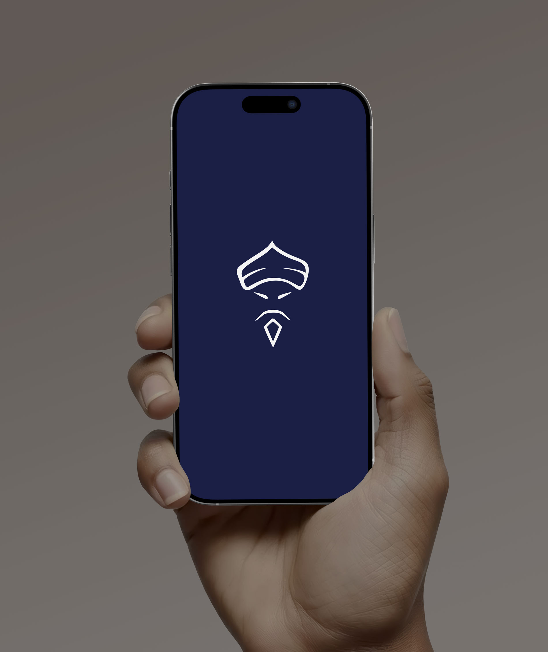
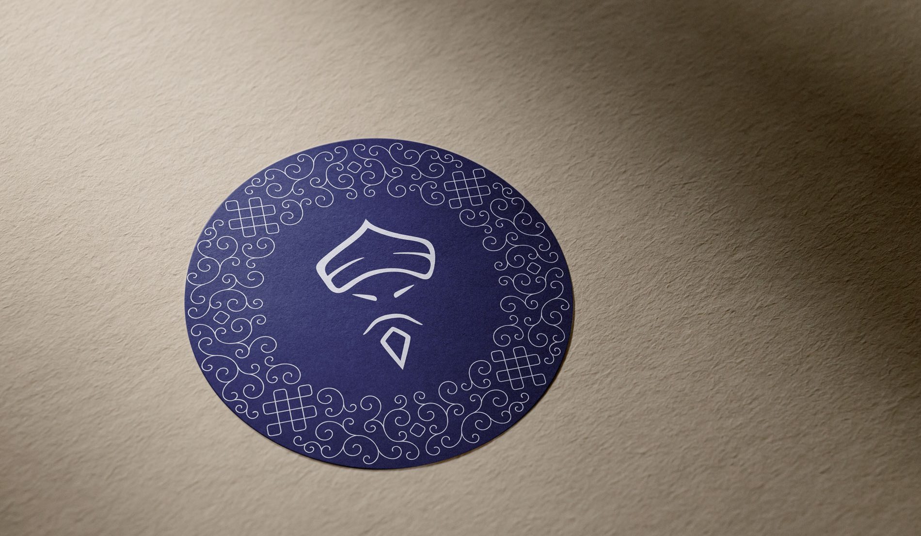
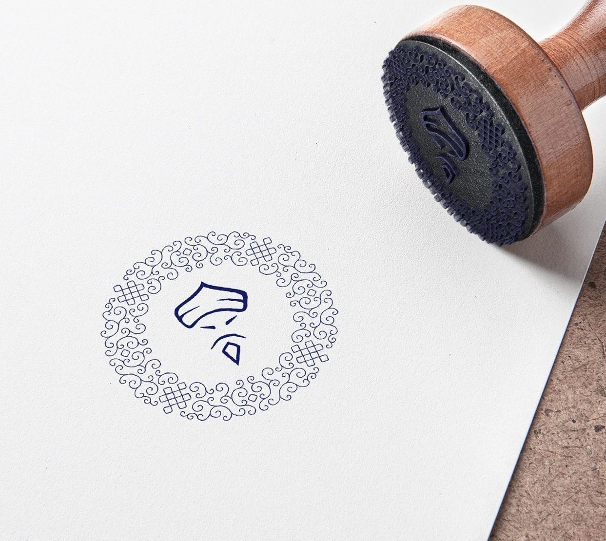
I based my decisions on audience research, focusing on participants of Historical Medieval Battles (HMB) and Buhurt. To keep the brand recognizable in this niche, I kept the iconic Mongolian face but softened its features for a modern touch. I added a chainmail-inspired ornament for symbolism and created a custom script-style font referencing Mongolian Sanskrit to emphasize craftsmanship and cultural roots.
Process & Inspiration:
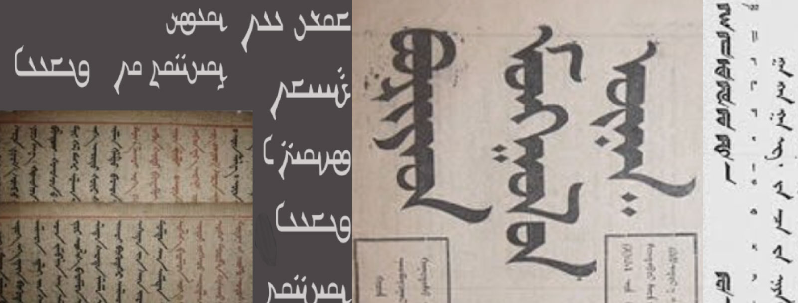
I studied numerous Mongolian ornaments and manuscripts to deeply understand the visual language of the culture. Inspired by traditional motifs, I created a custom chainmail ornament based on authentic Mongolian patterns. For the logo lettering, I analyzed the structure of ancient scripts and manually recreated the flow of lines, developing a font that echoes the elegance of historical Mongolian manuscripts.
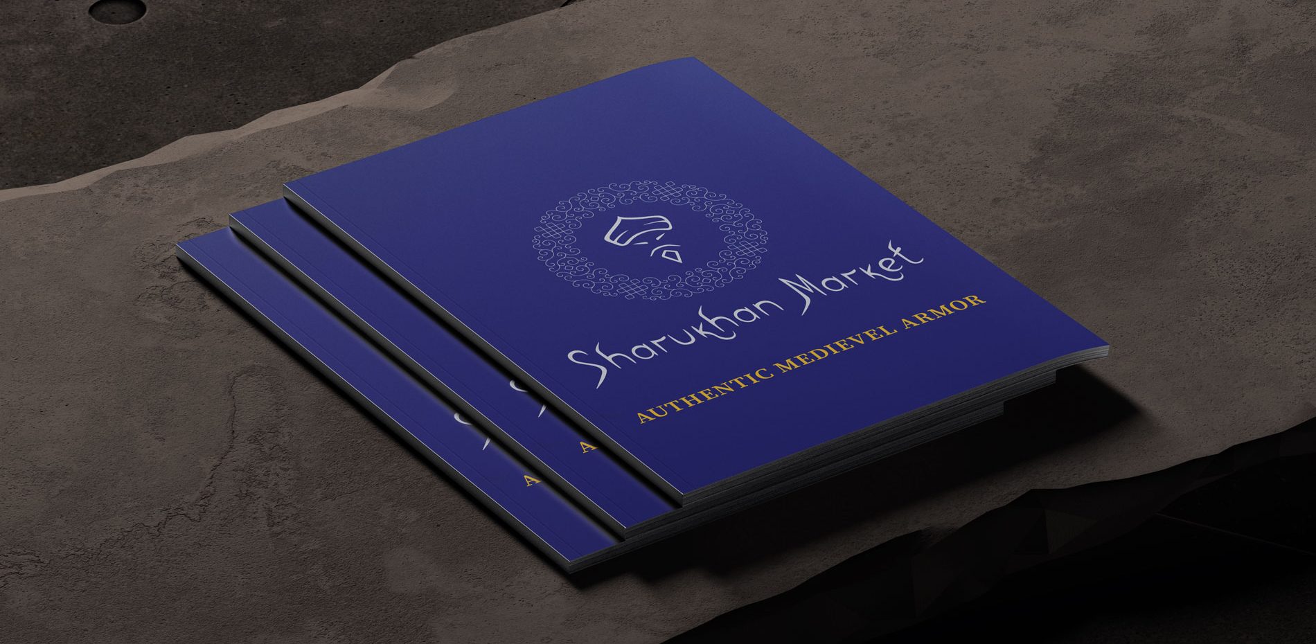
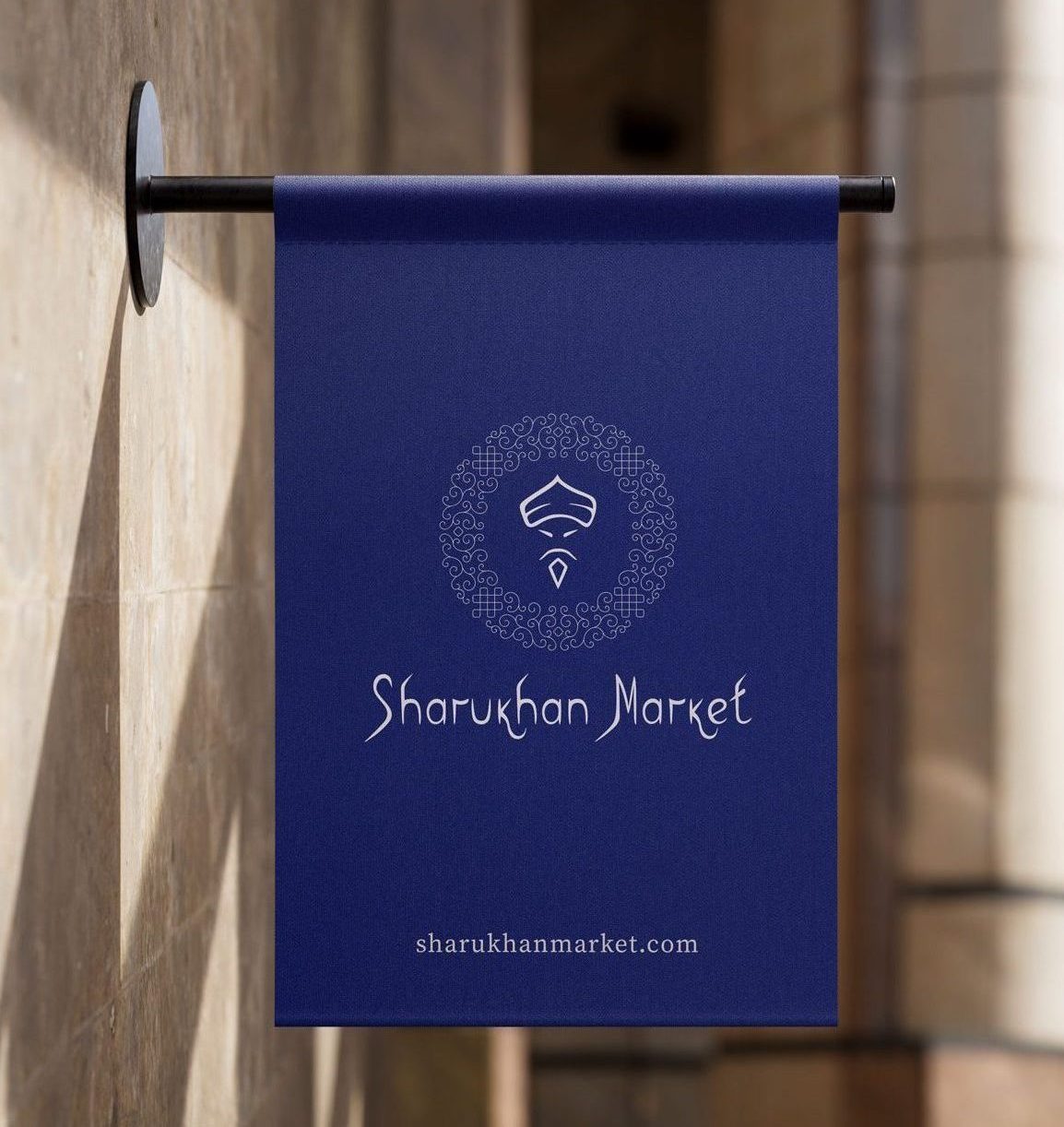
Result:
The final logo is a visually striking, artful symbol that combines historical authenticity with a modern aesthetic. It has been well received at medieval events, giving the brand a unique personality and strong visual identity. The design is easily recognizable, culturally rooted, and adds emotional and historical depth to the Sharukhan brand.