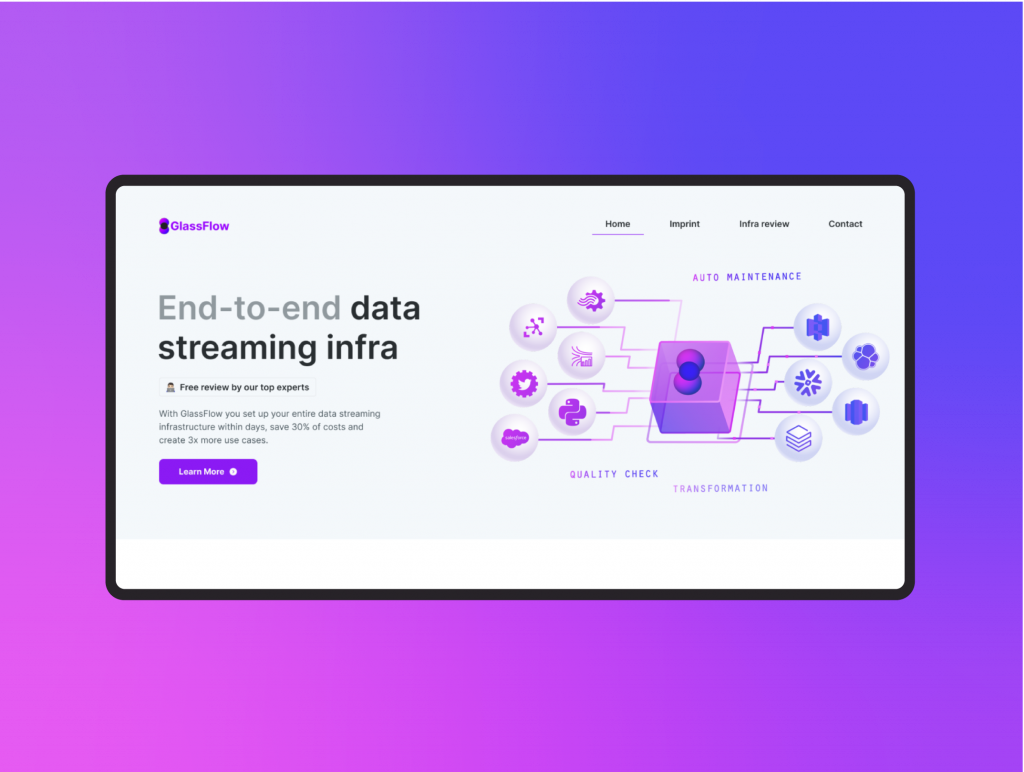
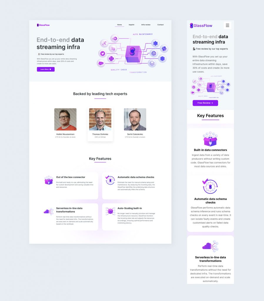
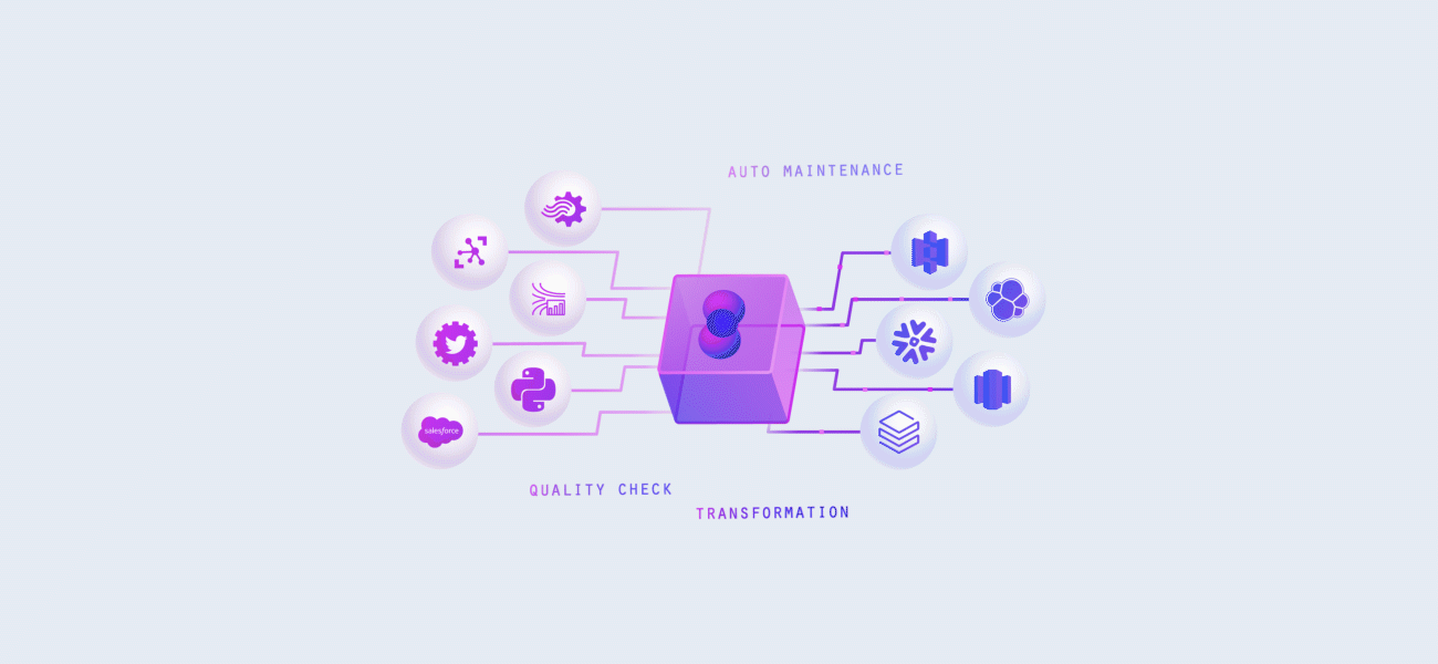
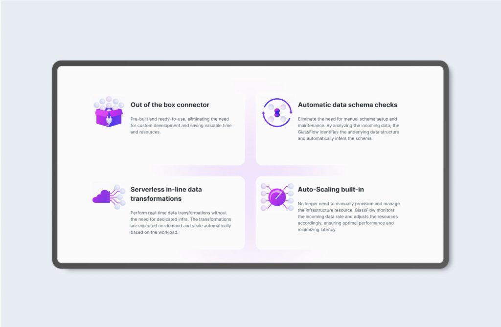
Animated Icons and Web Illustration for GlassFlow Company
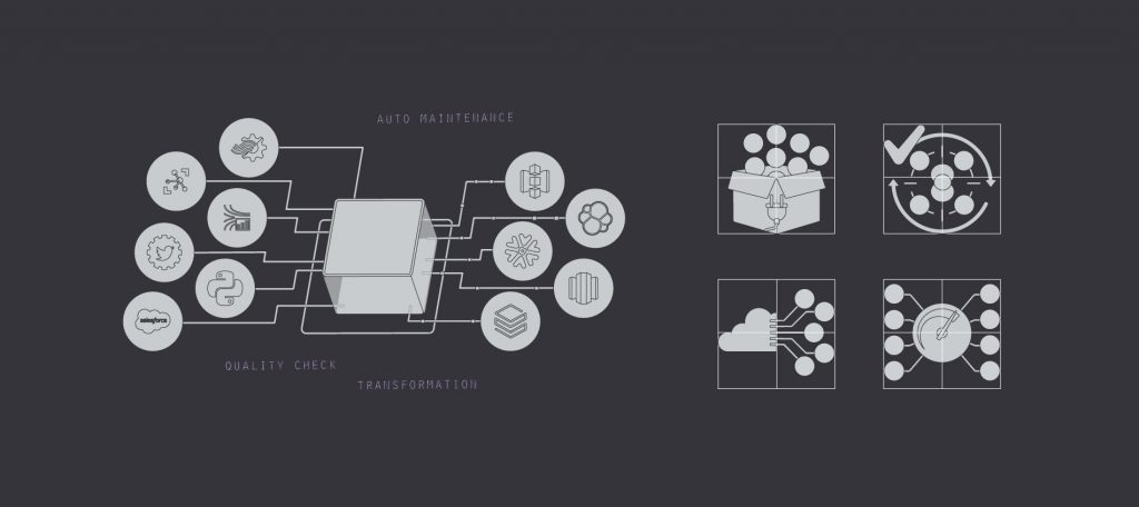
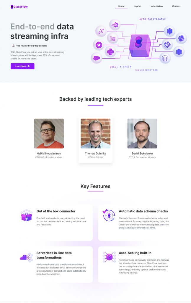
TASK: The task was to create an illustration for the main page that would show the operating principle of this platform.
As well as icons explaining the key features of the company.
SOLUTION: It was decided to create a design that would match the logo design and use the same gradient. So that all attention would be focused on the key features of the platform, I suggested to the client to animate the icons with animation. In the illustration, it was decided to create a light animation that would not distract much from the text on the main page and show the advantages of this platform over competitors.
CONCEPT: In order to identify the main features of the company, I studied the competitors, found their weaknesses and emphasized the advantages of this platform, then I identified the company’s potential clients to show them the key features that will make their work easier. The purpose of icons is to capture the user’s attention to show Glassflow is user-friendly, saves resource sand time. Principles for icons to make them simple, easy to understand, no small details, perfect pixels, trendy animation.